BitoDebt · Fintech · 2019–2020
From experiment to 25% of company revenue
I designed Taiwan's first fixed-income digital asset product — from MVP to market leader, through three iterations of trust, compliance, and product-market fit.
ROLE
Design Owner — Research, Strategy, UI/UX, Visual, Brand
TEAM
2–6 people · Legal, PM, Eng, CS
DURATION
1 year
+34%
CONVERSION LIFT
100%
SELL-OUT RATE
+57%
TRADING VOL.
25%
COMPANY REVENUE
Challenge
Nobody trusts a product they've never seen.
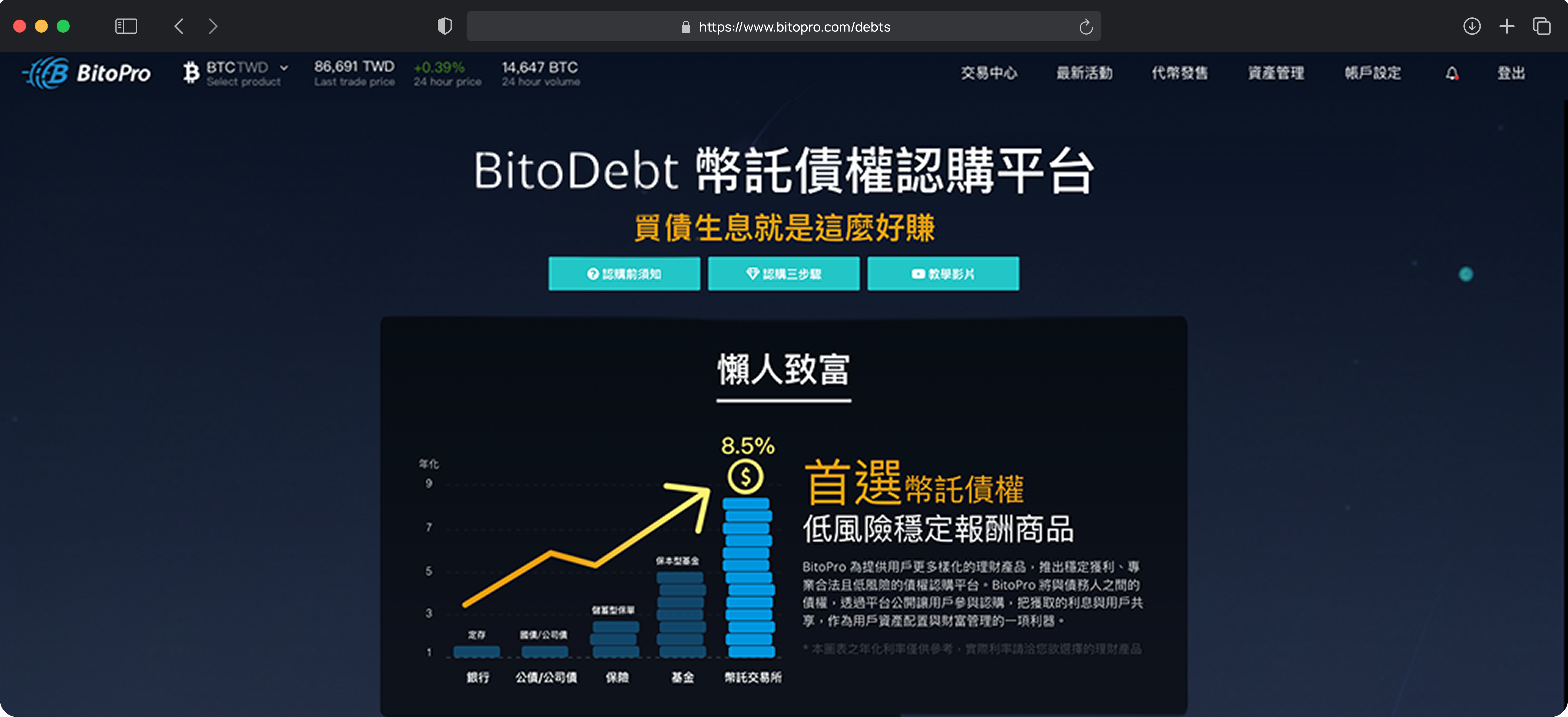
Taiwan's first fixed-income digital asset product: users deposit stablecoins, receive principal plus fixed interest (8.5% APY) at maturity.
The problem wasn't usability — it was courage. Users understood the flow, but didn't dare press "Subscribe."
How is investor trust forged?
Past Performance Records
New investors see the reality of profits when shown the investment reports of others.
“When the host laid out the investment reports right in front of us, I felt I could trust it.”
Visible Physical Services
Attending offline seminars, seeing real people present, and having a physical storefront doubles the sense of security.
“Max has a physical store, feels legitimate. I know I can find someone if needed.”
Word of Mouth & Community
When many people discuss the same service, investors perceive strong word-of-mouth and easily choose the familiar name.
“Bito has high credibility. I see them in the news and people discuss them on PTT forums.”
The Anxious Investor
Crypto Holder · Research Composite
“I hope for stable growth without worrying about crashes. Banks are too conservative, but going all-in on crypto is too aggressive...”
Frustrations
- −睡眠障礙:高達 83% 的用戶表示市場波動會影響睡眠
- −強制盯盤:高達 68% 的用戶會在凌晨反覆查看投資組合
Goals
- ✓Asset allocation: 75% of users want a stable yield to balance risk.
- ✓Passive income: Looking for a hands-off wealth management channel.
Users buy psychological safety, not financial products.
Data shows this product isn't to create huge profits, but to let users sleep peacefully. The guiding principle for our UX must be "absolute transparency and trust".
Iteration 01
Ship first, don't chase perfection.
Judgment: Strip it down to the skeleton.
Team of 2, strict legal compliance. I stripped the product to minimum: one subscription flow, plain language, zero visual packaging.
The hardest part wasn't designing the flow — it was naming the product. "Debt rights" was the legally approved term — accurate, compliant, but users couldn't understand it. I spent weeks negotiating with legal: they guarded compliance, I guarded user comprehension. Final decision: keep the legal name, but translate it into plain language at every touchpoint.
BitoDebt
Fixed-Income Subscription Platform
MVP wireframe — one flow, nothing extra. (Abstract UI Flow & Interface)
Launched successfully. Conversion rate: 22%.
Users came and looked, but didn't dare press "Subscribe."
Iteration 02
Make the abstract tangible.
Judgment: Trust matters more than flow.
Data showed users didn't distrust the flow — they distrusted the concept. I needed to make "fixed-income digital assets" feel real, not scary.
Page views ×2.5–3.5, longer dwell time, more users entering subscription flow.
But conversion didn't scale proportionally — more visitors, but completion didn't keep up.
Iteration 03
BitoDebt was more than conversion optimization; it was a journey of translating unfamiliar financial products into something users could understand and trust.
Judgment: Admit, fix, learn — same day.
After launch, customer service reported an emergency: "Users are furious — they can't find the BITO payment option." I had assumed most users wouldn't hold much BITO (platform token), so I defaulted to USDT. That assumption was wrong. 75% of long-term users held significant BITO and wanted the fee discount (20% → 10%). Some had already paid the higher fee. In fintech, a wrong default isn't "inconvenient" — it causes real losses.
Support Escalation
Fee Selection Iteration
V1: The Hidden Toggle
A standard toggle defaulted to USDT. Easily missed by users rushing to subscribe.
V2: Explicit Choice
Removed the UI default. Forced users to explicitly choose between the two options.
V3: Optimized Hierarchy
Based on data (75% prefer BITO), repositioned BITO to the left as the primary visual action.
Just swapped left and right, changed the default. Fixed same day. Support complaints dropped to zero.
“Thanks, I finally bought it.”
— Telegram
“This is exactly what I wanted — simple and straightforward.”
— Telegram
Key Finding
Trust can't be designed — only proven.
After fixing the payment issue, I conducted a second round of user interviews. The finding changed everything: trust didn't come from my design. It came from three external signals.
Strategy Shift
Phase 1
MVP — Ship First
Users didn't understand the concept. We chose a minimal MVP — kept only the core purchase flow, removed all non-essential info, let users complete the basic operation first.
“Let the product survive first, then educate the market.”
How I Collaborate
No authority, still drove change.
"Naming alone was a battle"
"Debt rights" was what legal required — accurate, compliant, but users couldn't understand it. Weeks of back and forth. They held the line: compliance. I held the line: user comprehension. Final call: keep the legal name, translate at every touchpoint.
"I initiated the brand, they amplified it"
The Magic Bean visual system wasn't marketing's brief. I created the Mood Board, built the concept, then handed the visual language to marketing to extend across campaigns.
"My fastest user research channel"
After the BITO payment incident, I joined user Telegram groups, attended weekly CS meetings, recruited interview participants through CS. The most critical design fix came from a forwarded complaint — not from data analysis.
Results
From experiment to core business.
CONVERSION LIFT
22% → 56%
SELL-OUT RATE
Sold out within a day
TRADING VOL.
Exceeded target
COMPANY REVENUE
Of company total
Years later, the live version is still my original design.
“Since using BitoDebt, I can finally sleep in peace. The anxiety of waking up at midnight to find my assets cut in half is gone. Now 30% of my crypto portfolio is in BitoDebt — it gives me stable returns and peace of mind.”
— Bob, long-term user
讓人安心到願意按下「認購」
它變成了用戶會回來的那個產品
Reflections
Four things I learned building a trust product.
Challenge your most confident assumption.
The payment default error taught me: in fintech, a designer's intuition is the most dangerous thing.
Trust can't be designed — only proven.
No visual metaphor beats a real user's feedback screenshot. What a designer can do is not block the sources of trust.
The fastest research channel is inside your company.
The most critical design fix didn't come from interviews or analytics — it came from a forwarded complaint from CS. But that wasn't luck — I had proactively built that relationship.
Design ownership means seeing the gap and filling it.
The Magic Bean concept wasn't in anyone's brief. I saw the need, did it myself, then handed it to marketing to scale.